Increase Sales Conversion
Can’t turn your site traffic into sales?
Reduce Cart Abandonment
Your customers abandoning their carts?
Promote Products & Offers
Make potential customers notice special offers.
Collect Form Submission
Struggling to collect form submissions?
Get More Phone Calls
Let them call you directly via popups.
Grow Email List
Having trouble growing your email list?
Gamify Your Campaign
Choose your offer and let the game begin.
Make Announcement
Make sure important news unmissed.
Increase User Engagement
Keep visitors & customers on your site longer.
Collect Feedback & Surveys
Can’t draw attention to your surveys?
Facilitate Social Sharing
Grow social media followers and likes!
20 Inspirational Popups Used by Famous Brands
Would you like to see some inspirational popups used by famous brands and understand why they work?
Then, buckle up because I'm going to give superb popup examples and explain why they work. Plus, I'll give you a method of creating attractive popups like famous brands without needing to know design or coding knowledge! Let's begin.
# 1.CoSchedule
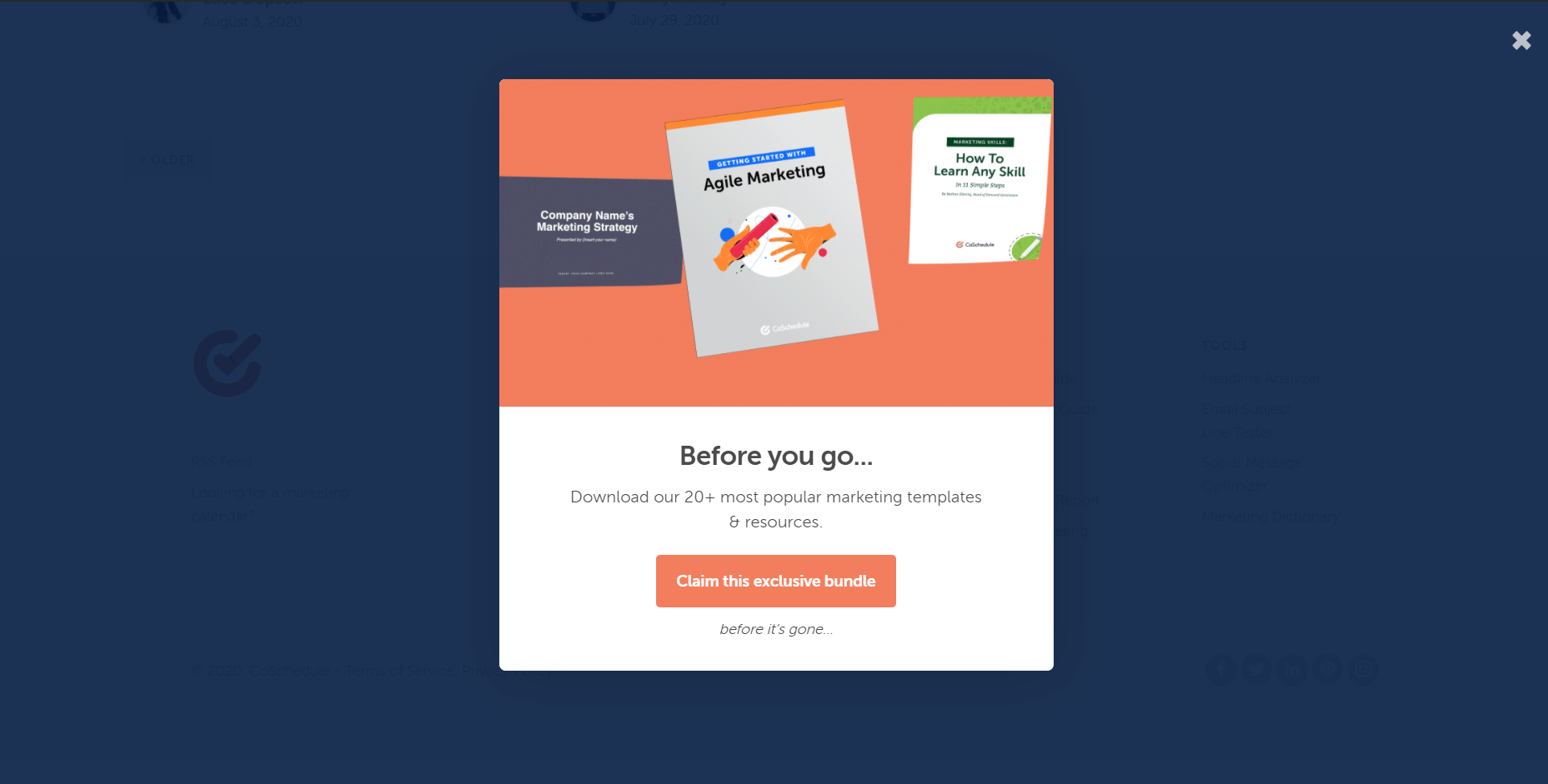
CoSchedule is a great B2B example. They have a brilliant reputation in content marketing community. This exit-intent popup shows up when a visitor attempts to leave their website. They are promoting their popular marketing resources to convert visitors before they leave.
# 2. Sitepoint
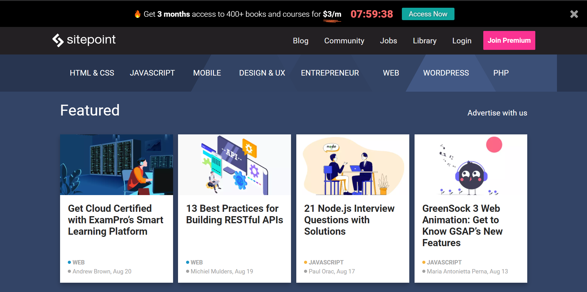
Sitepoint chooses to use a top banner popup which is relatively the least disturbing popup type. Through this popup, they benefit from the fear of missing out and try to convert more visitors.
# 3. Dolce & Gabbana
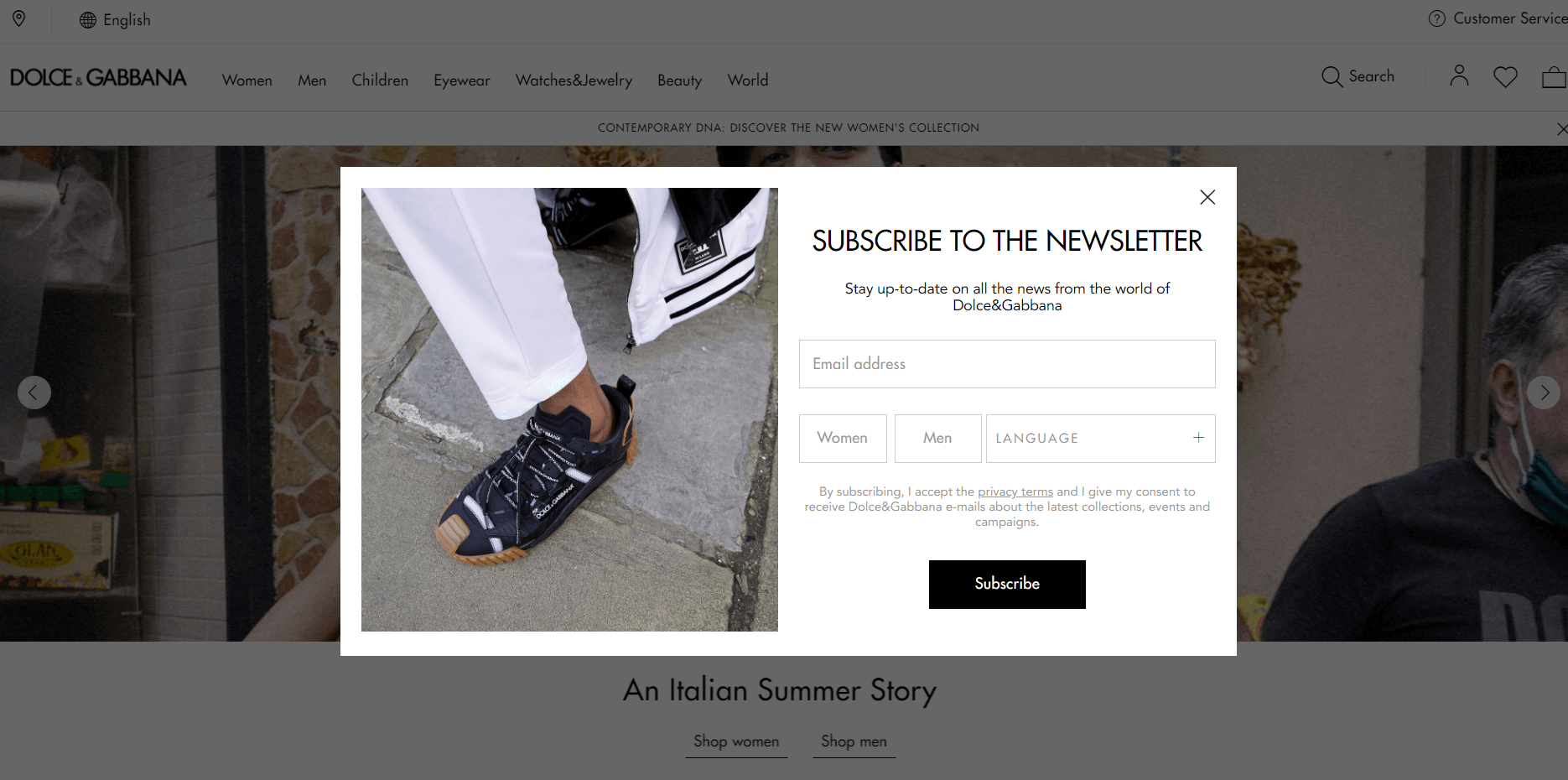
The famous fashion brand Dolce & Gabbana uses a newsletter popup. Their popup design is simple and elegant with an out of the ordinary image and black&white usage.
# 4. Forever 21
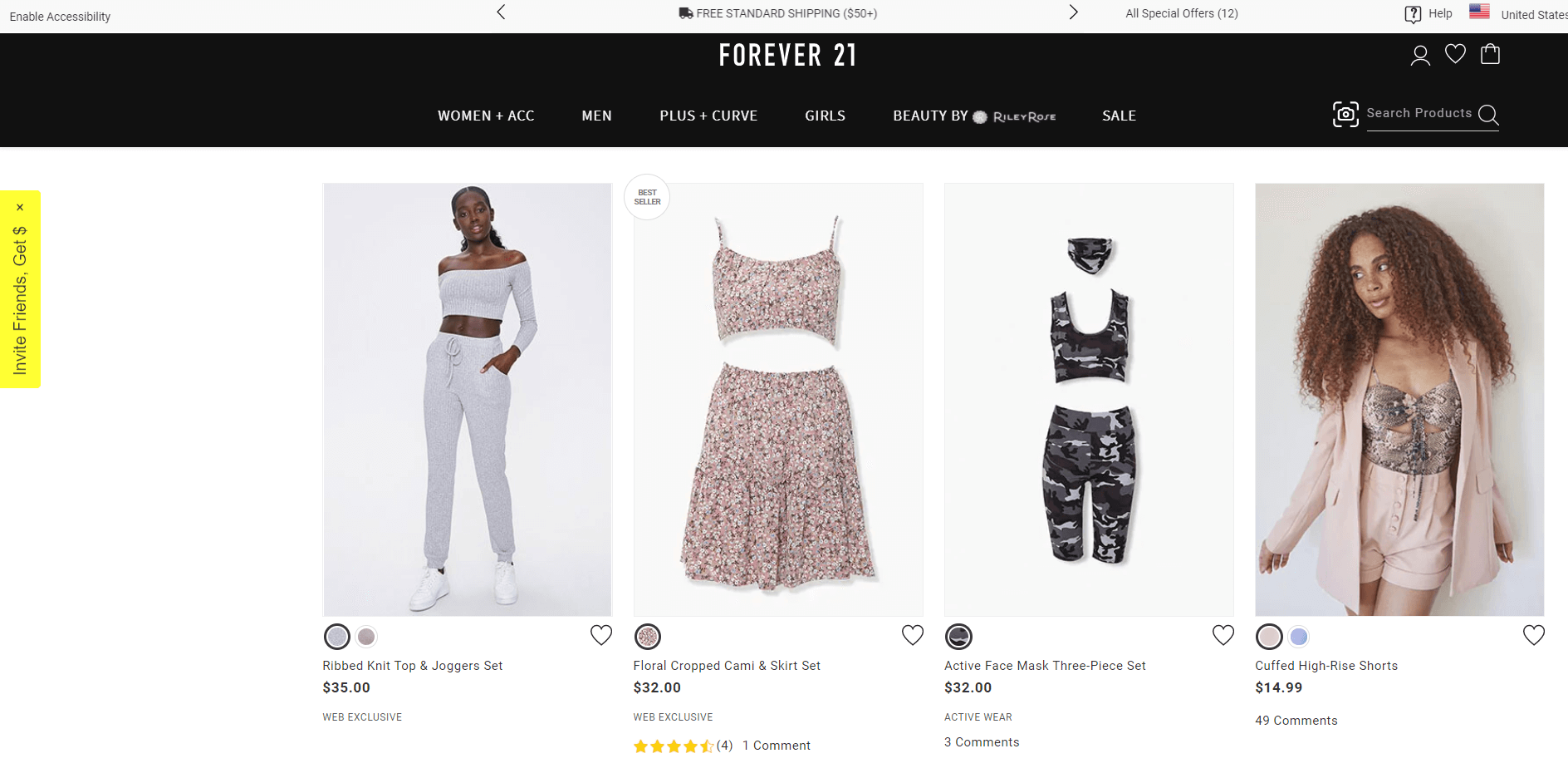
Another famous fashion brand Forever 21 uses a teaser popup its website. Teaser popups are a great way to avoid disturbing the customers. It shows up the main popup when clicked on.
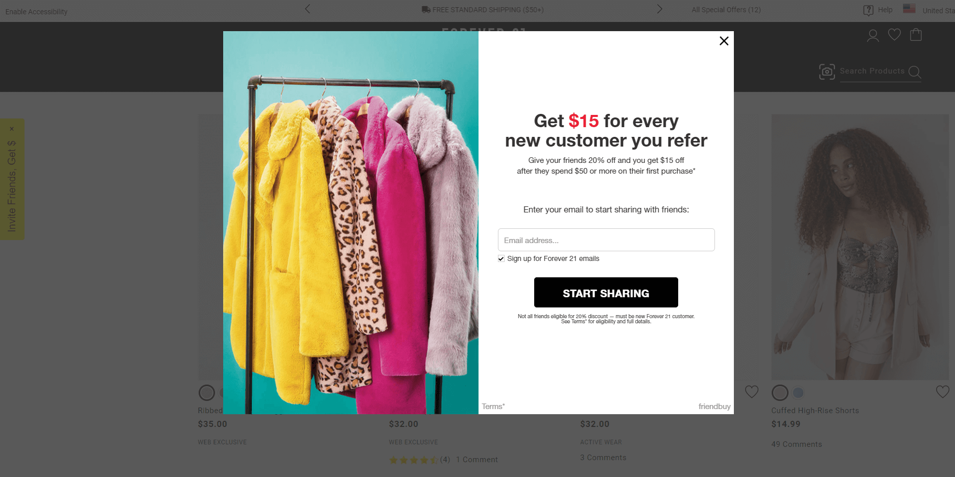
This is the main popup offering an irresistible incentive of $15 for every customer you refer the brand to. Moreover, they get the customers' emails for email marketing campaigns as well. More customers means more conversions and more sales. Also, the image choice is excellent with outstanding colors.
# 5. Mic
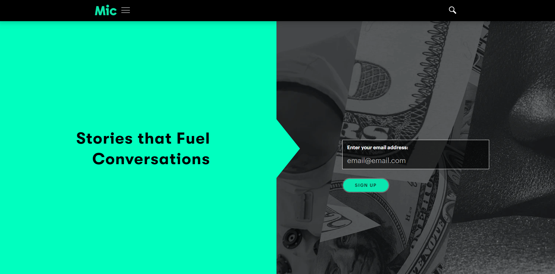
This popup example is from Mic. It is not really common to use full page popups, but this one looks just right. The color choice and simplicity is easy on the visitors eye.
# 6. Stradivarius
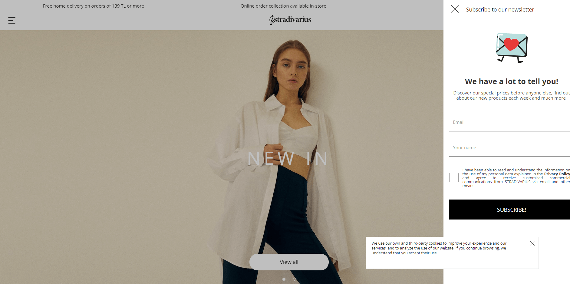
Stradivarius uses a sidebar newsletter popup to collect users' emails and strengthen its email marketing campaigns. The design of this popup is simple and to the point.
# 7. Ulta Beauty
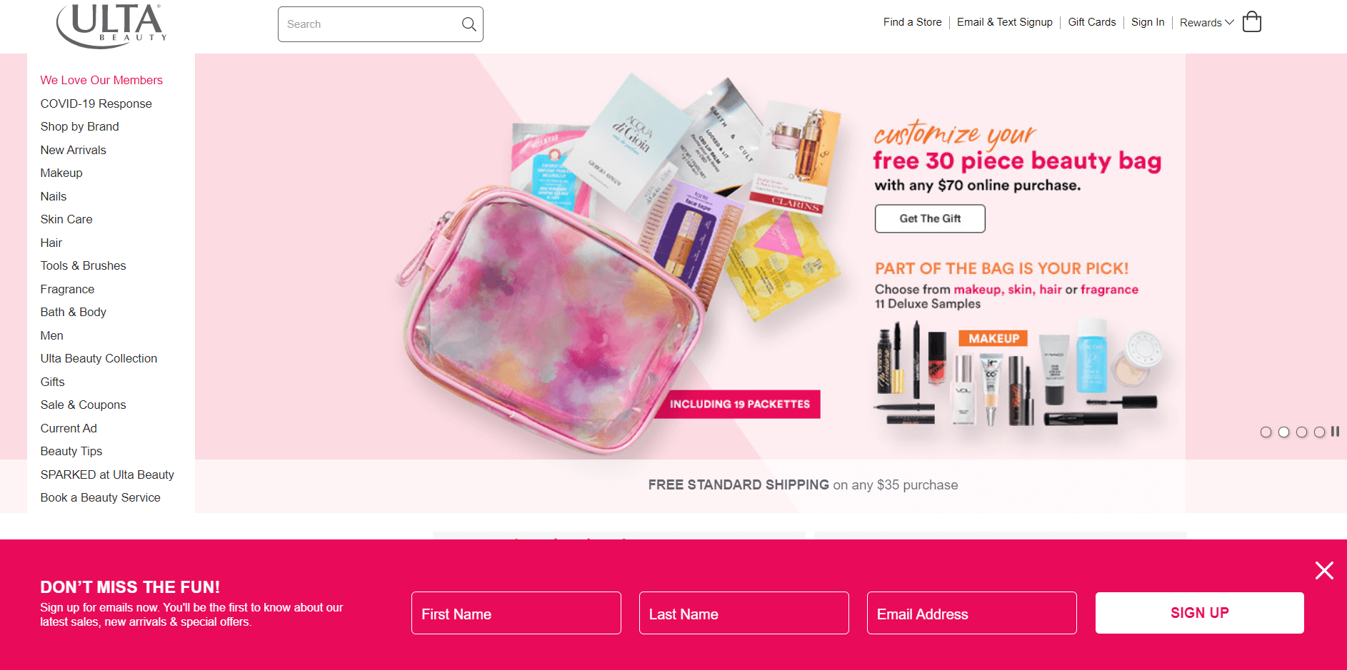
Ulta Beauty chooses a floating bar popup at the bottom of the website. The pink color of this popup is in harmony with their homepage design. The headline "Don't miss the fun!" is triggering as well.
# 8. Urban Decay
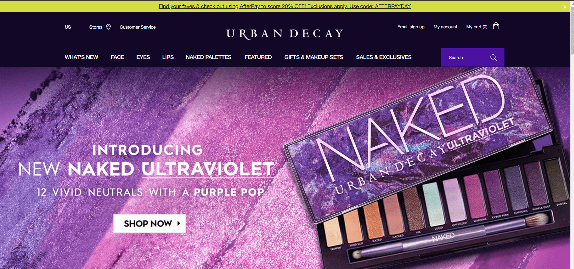
Urban Decay's popup banner is yellow to draw the attention of the customers while being less intrusive with the user experience.
# 9. Urban Outfitters
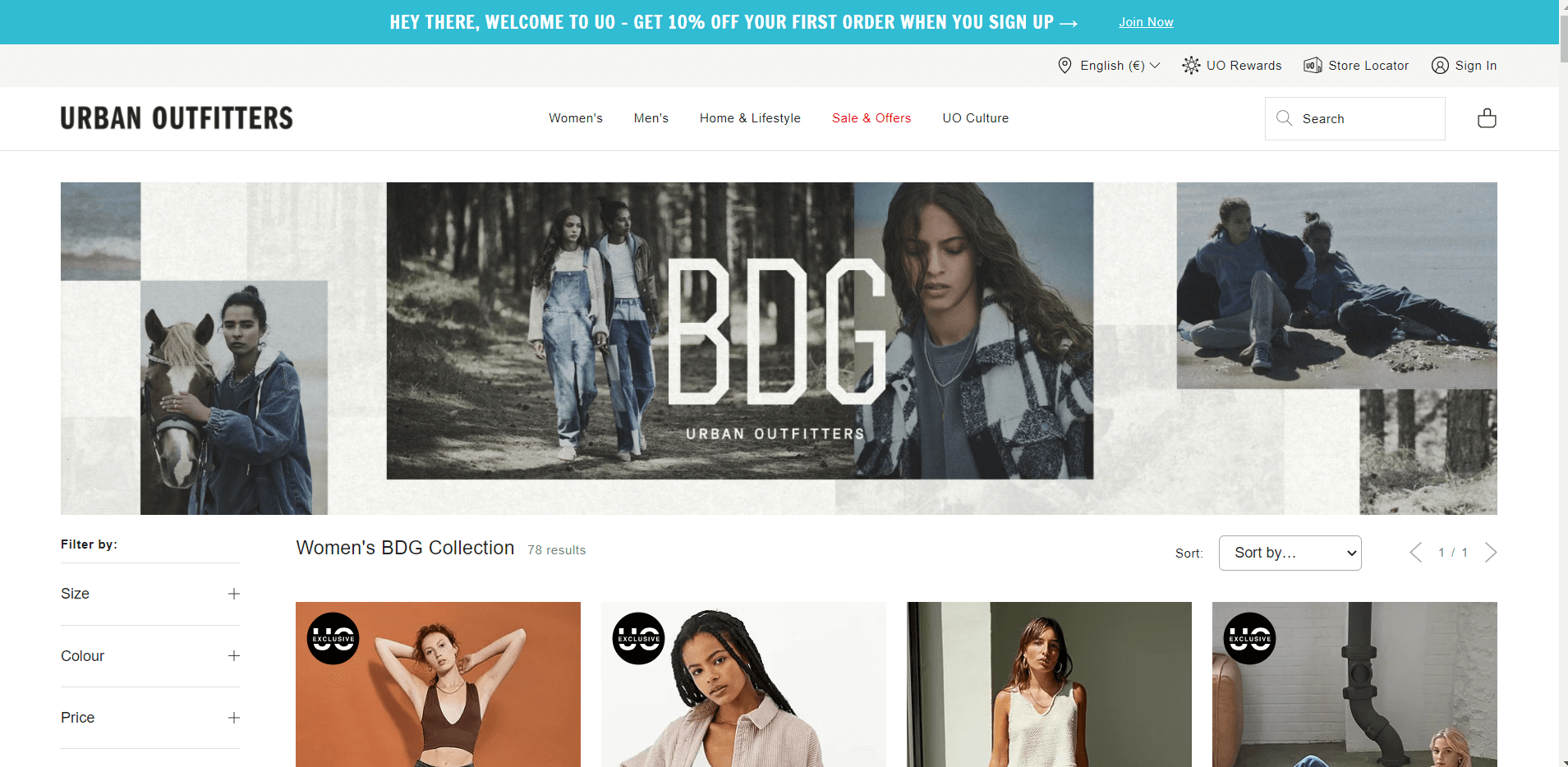
Urban Outfitters is another brand preferring a popup banner. The blue color of their popup is contrasting with the website color which is effective in catching the customers' eye.
# 10. Brunomagli
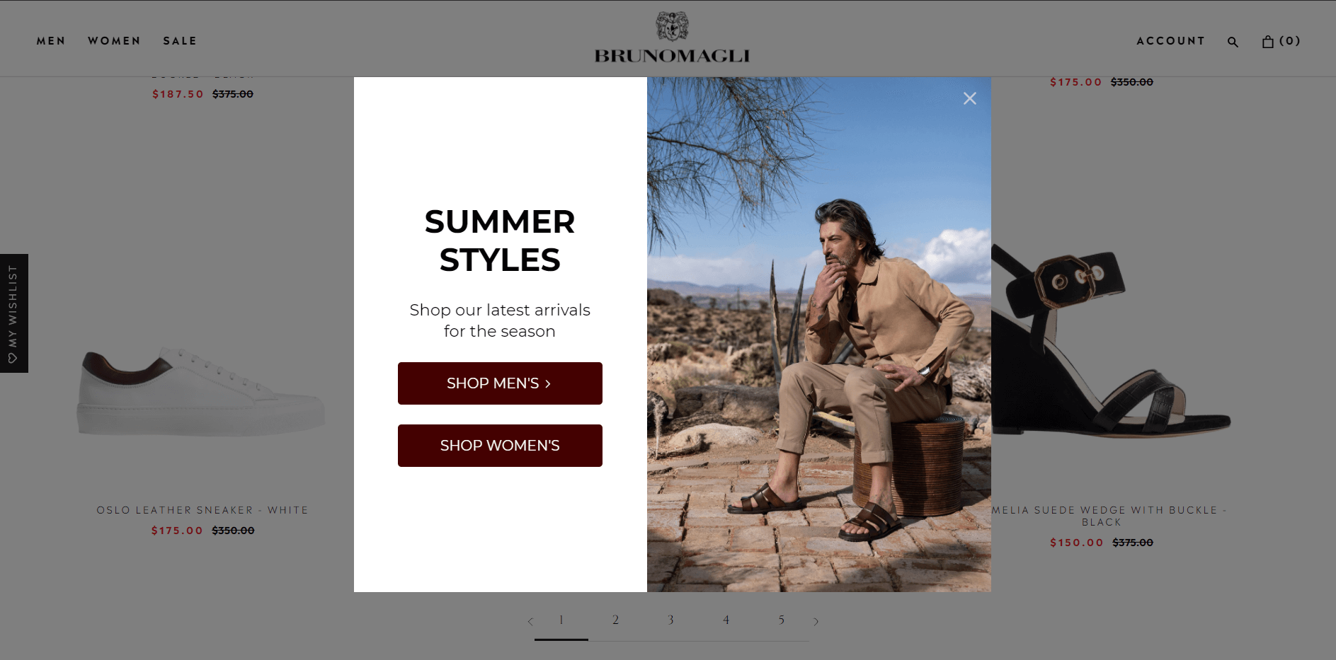
The product promoting light popup of Brunomagli drives customers to check the latest arrivals. See how the colors of the image complements the button colors.
# 11. Close.io
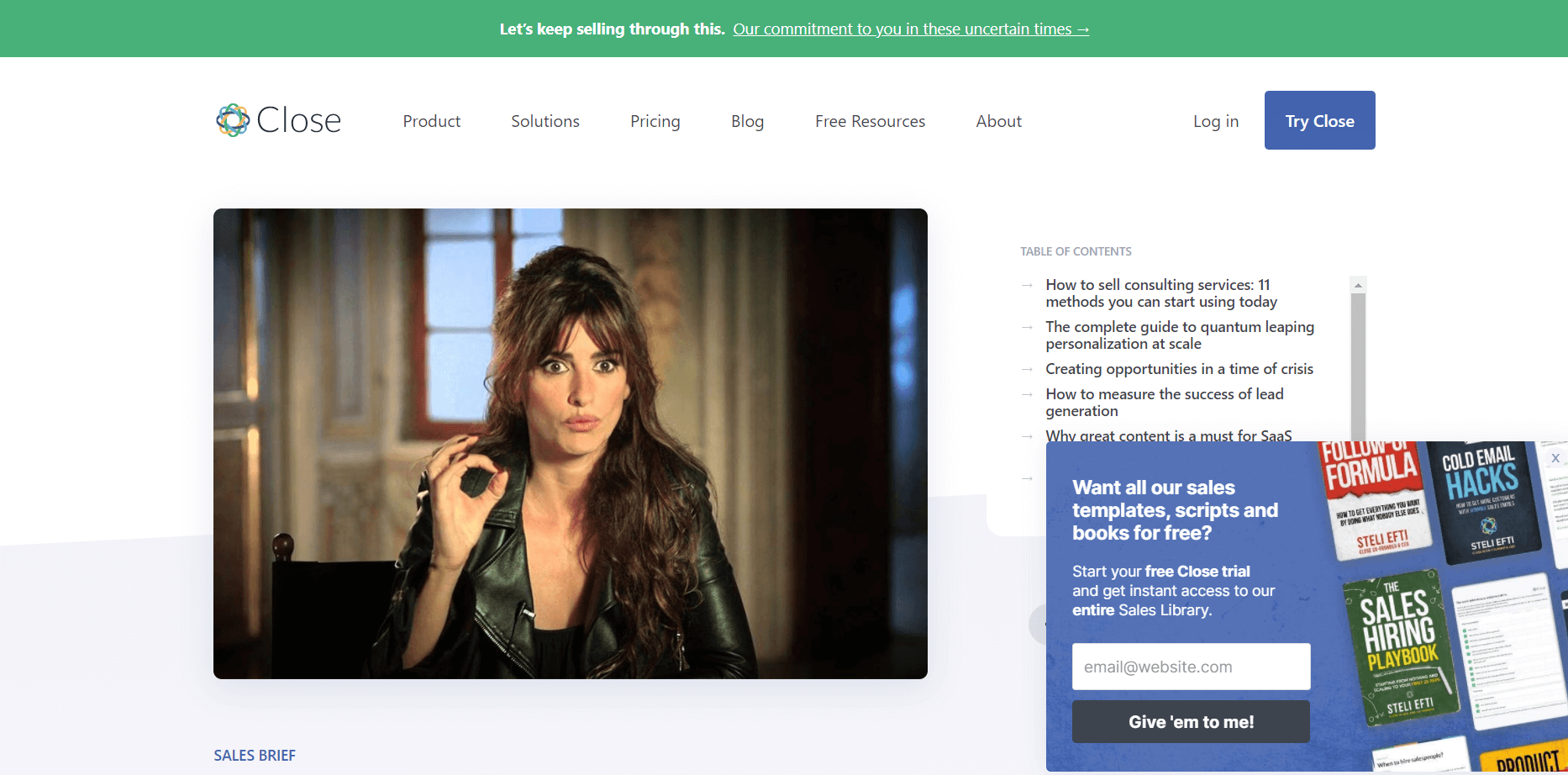
Close.io gathers new leads with a subscription popup. They also make a special offer of free templates, scripts, and books on the condition of subscription.
# 12. Digiday
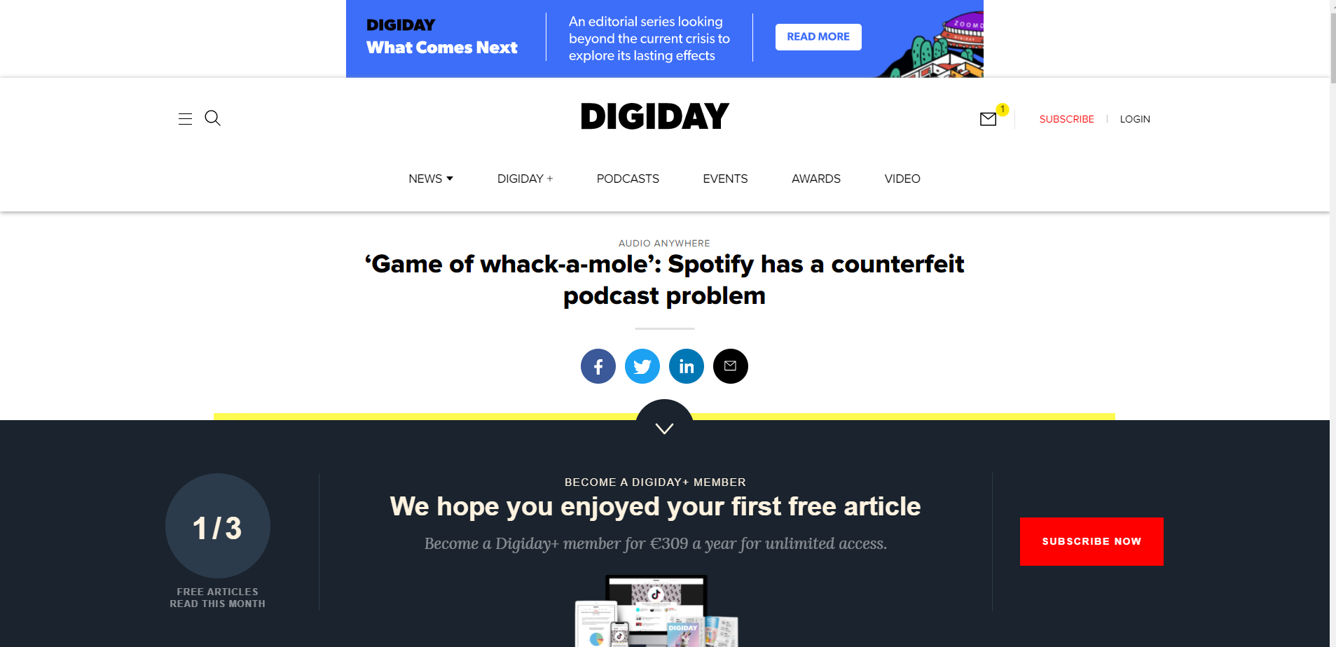
Digiday presents its floating bar popup once you scroll through their article. They give a quota of free articles and ask the readers to subscribe for more via the subscription popup.
# 13. Emailmonday
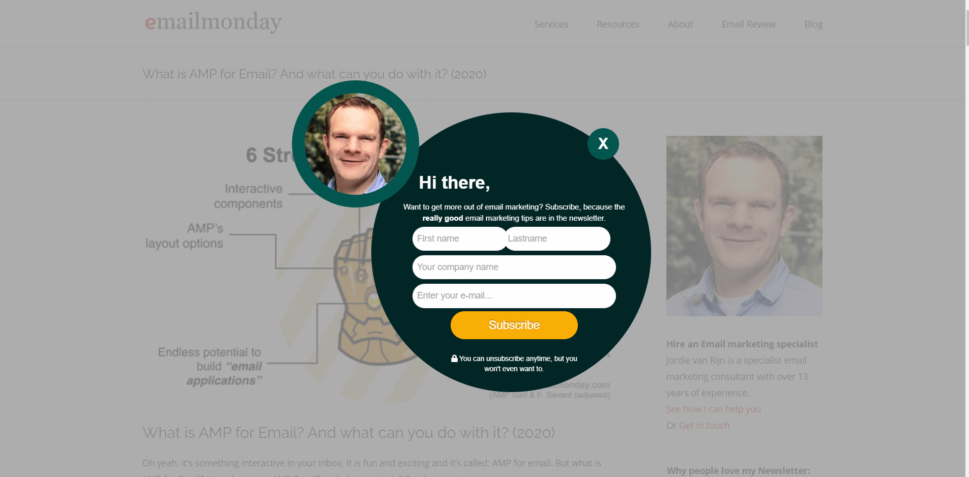
Emailmonday's popup has an uncommon style. It has a conversational tone saying "Hi, there" and includes the webmasters too.
# 14. Gaiam
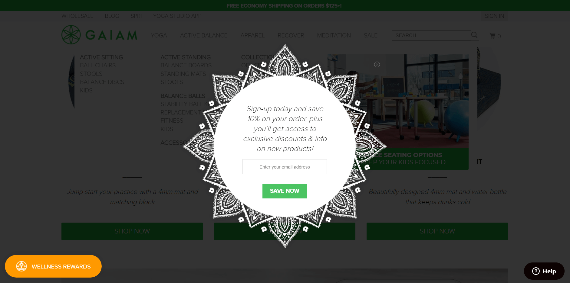
Gaiam's popup design is one of a kind. It suits well with the brand and offers a discount on subscription.
# 15. Kensie
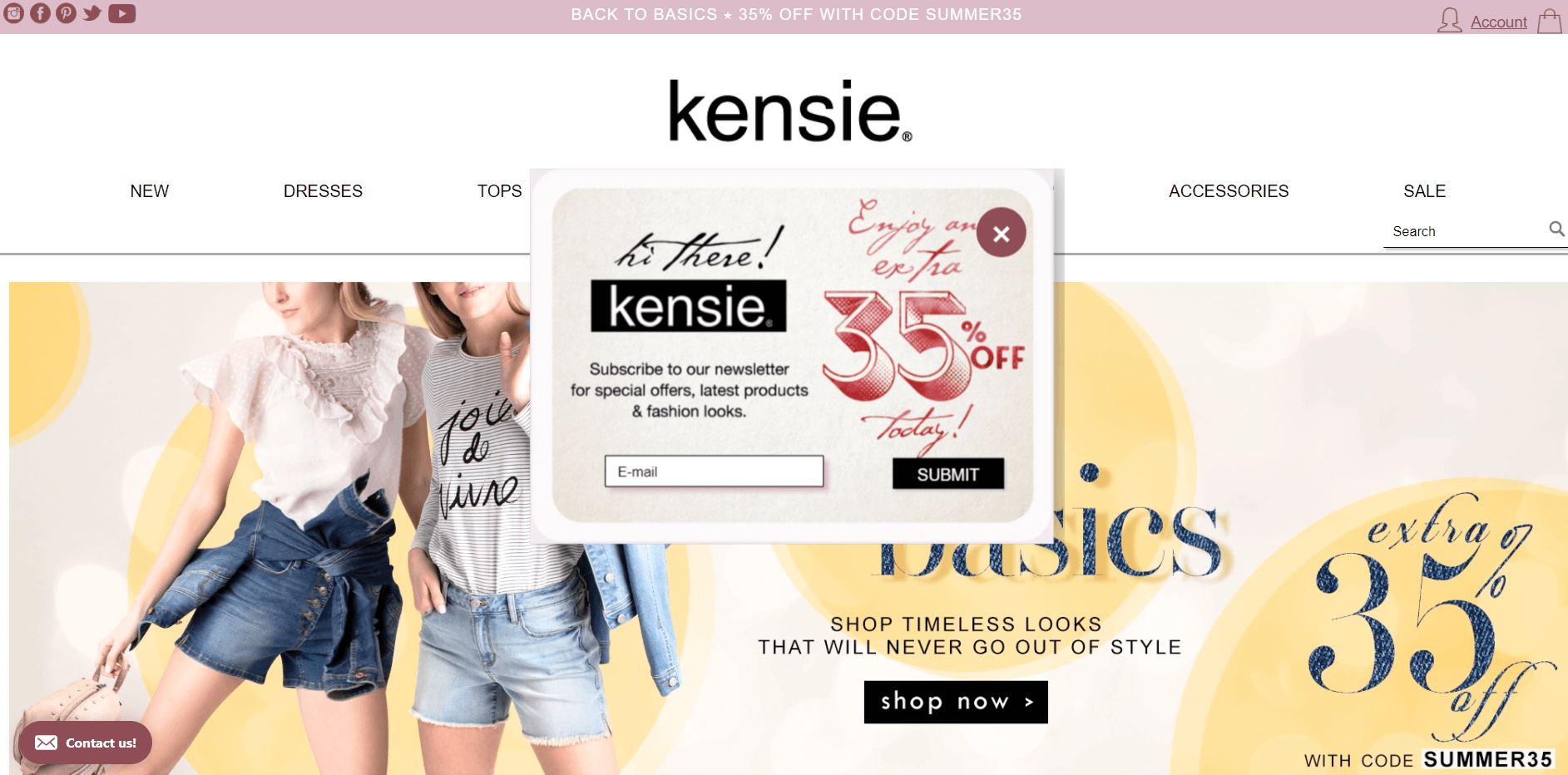
Kensie's newsletter popup encourages customers to submit their emails with a discount code.
# 16. The New York Times
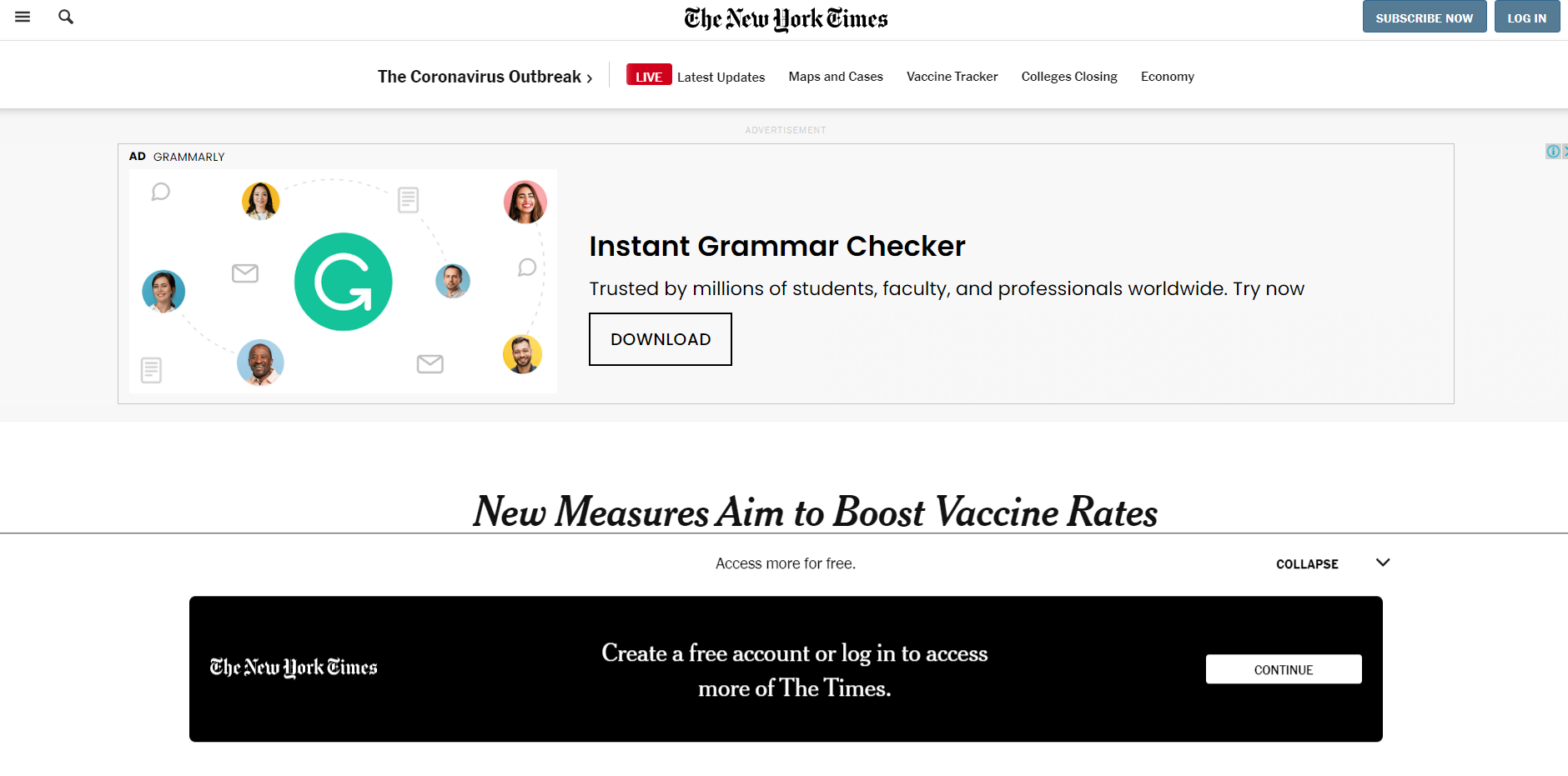
The floating bar popup of The New York Times suits perfectly with their website. The contrasting black color makes the popup stand out while still preserving a simple design.
# 17. Pipcorn
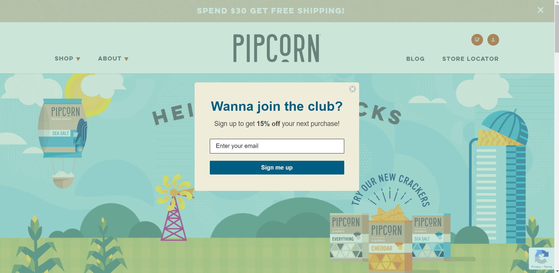
Pipcorn's light popup matches flawlessly with the homepage colors. The newsletter popups displays a special offer for subscription.
# 18. PracticalEcommerce
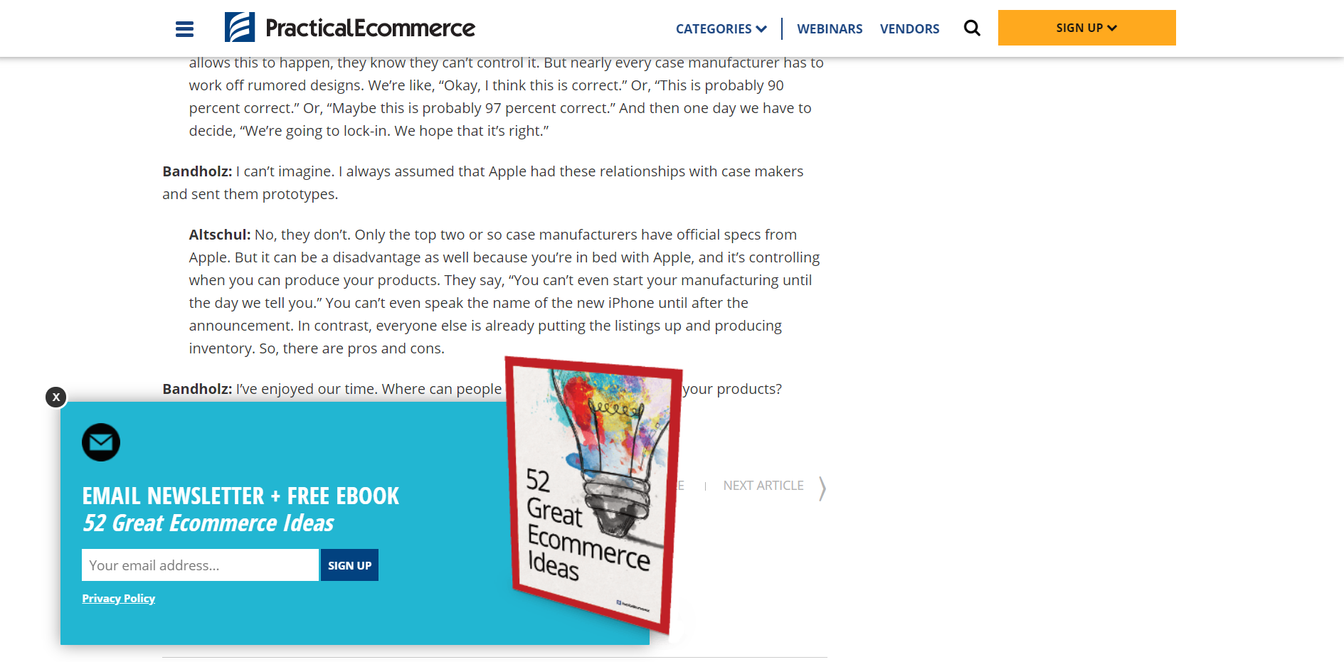
PracticalEcommerce presents a newsletter popup with an eye-catching color to draw the attention of the visitors and obtain leads.
# 19. Really Good Emails
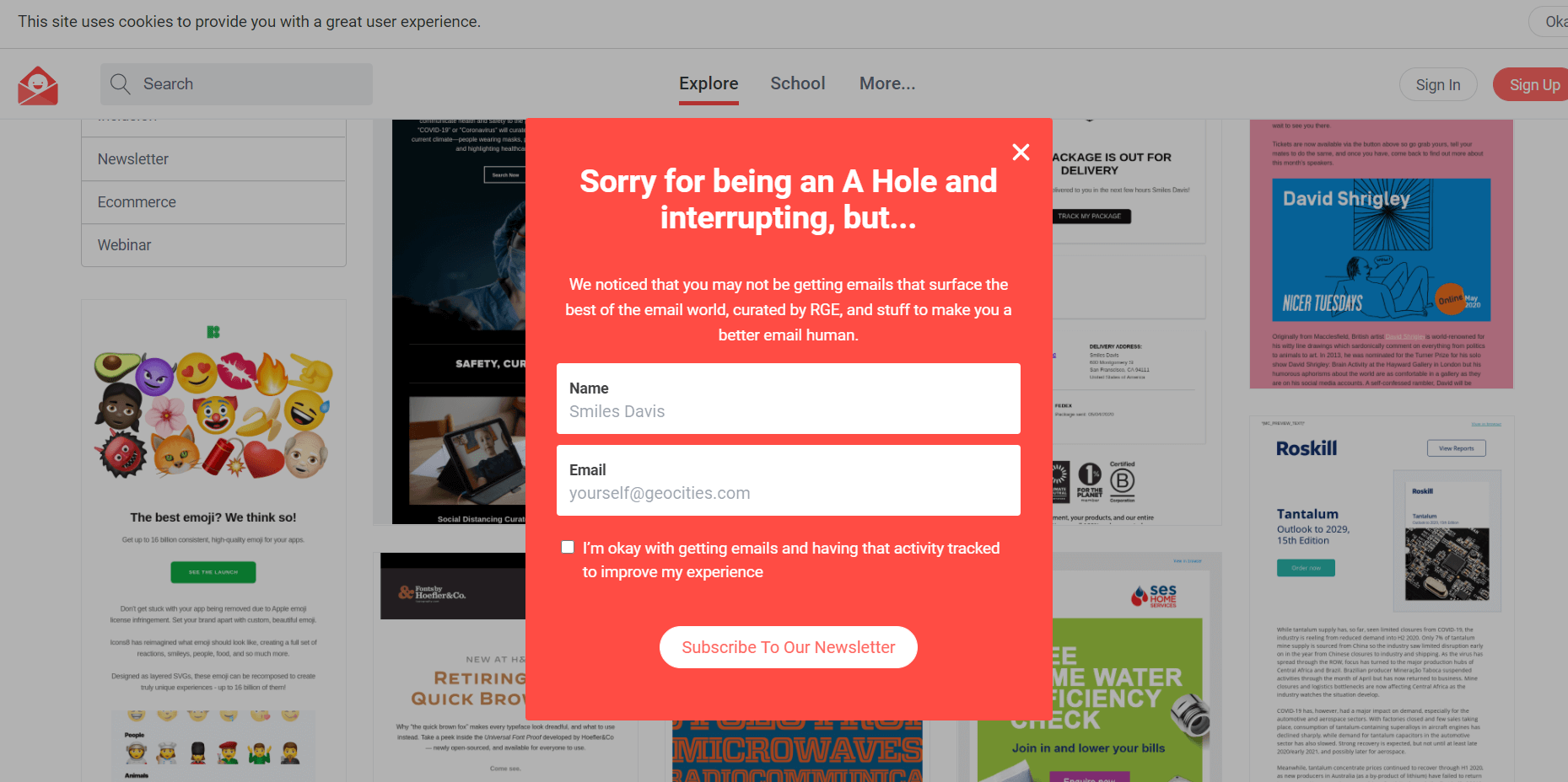
Now, if this is not a fun popup idea, what is? Really Good Emails uses an exit-intent popup with a bright color and a catchy headline to win back the visitors.
# 20. Versace
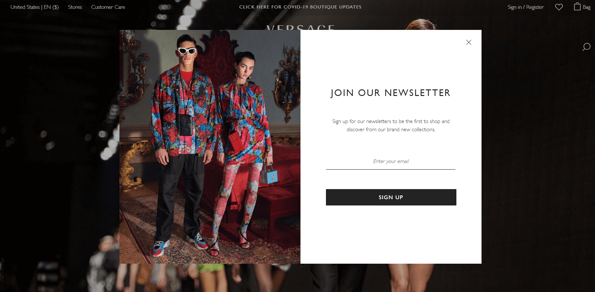
Versace's newsletter popup is an excellent example of the importance correct image usage. The image they use catches the customers' eye with bold colors and composition.
Yes, we have come to the end of the inspirational popup examples. Now, it's time to tell you how YOU can create stunning popups like these.
