Increase Sales Conversion
Can’t turn your site traffic into sales?
Reduce Cart Abandonment
Your customers abandoning their carts?
Promote Products & Offers
Make potential customers notice special offers.
Collect Form Submission
Struggling to collect form submissions?
Get More Phone Calls
Let them call you directly via popups.
Grow Email List
Having trouble growing your email list?
Gamify Your Campaign
Choose your offer and let the game begin.
Make Announcement
Make sure important news unmissed.
Increase User Engagement
Keep visitors & customers on your site longer.
Collect Feedback & Surveys
Can’t draw attention to your surveys?
Facilitate Social Sharing
Grow social media followers and likes!
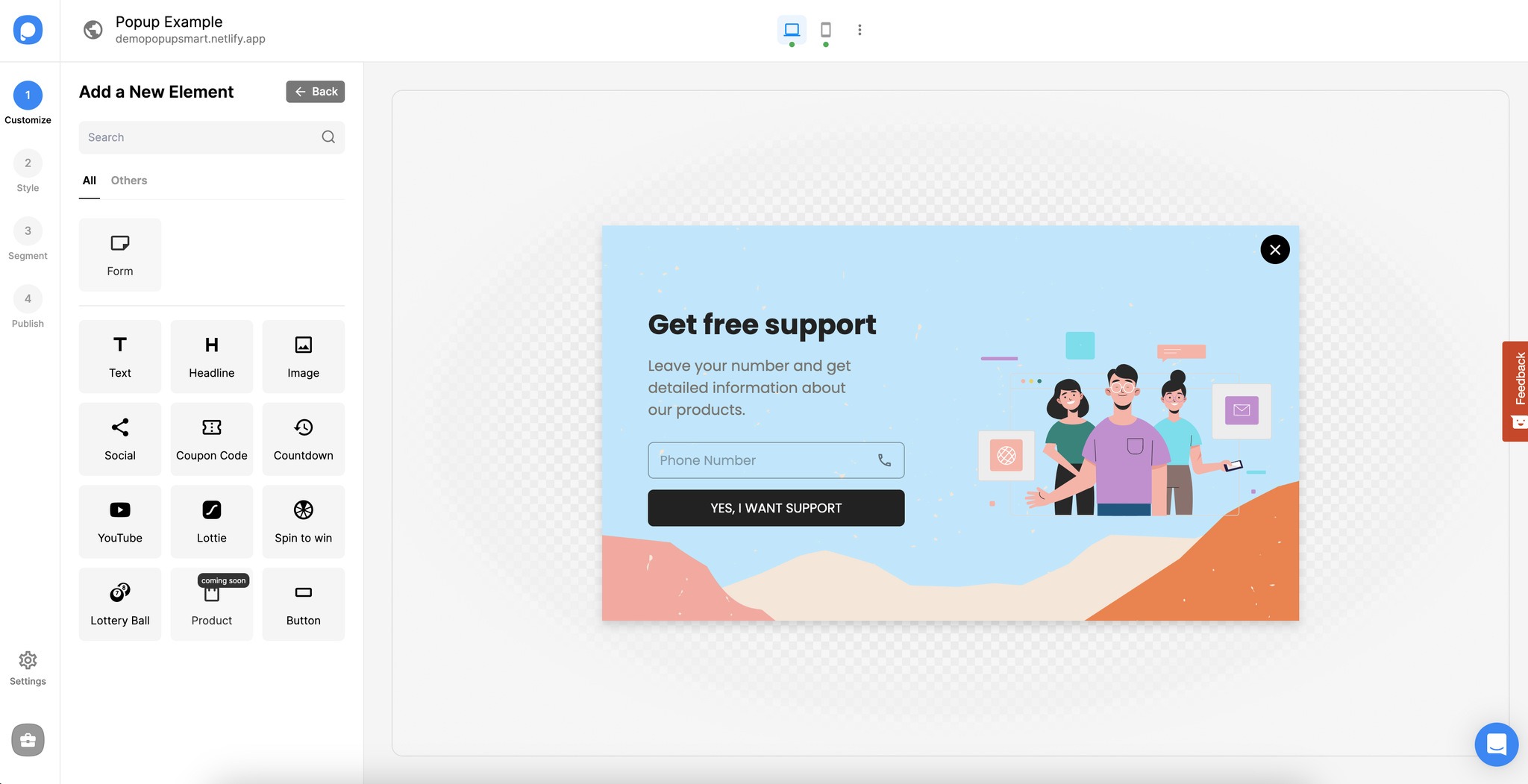
# Which Elements Can I Add to My Popup?

# Text & Headline
Use the Text & Headline elements if you want to give some information or have an announcement. Add text to your popup and customize the font, color, size, font weight, letter spacing, height, and alignment of your popup’s texts.
• You can write your text on the Content part of your Text component.
• You can align your text, add a link to your text, bold or underline it, and change its color.
• Besides, it’s possible to change your font, font size, and font style and determine line height and letter spacing.
# Image
It is one of the essential elements to customize your popup because the image about your campaign will influence your visitors more. To add an image to your popup, you can drag and drop the Image Element where it needs to be. If you wish, you can customize the size, border settings, alignment, and many other features of the image.
• You can upload your image & adjust its size.
• From the Layout option, you can arrange it as Cover or Contain. If you choose Contain, your image will be seen as it is.
• Also, you can turn on image linking for your images.
# Social Element
Use the Social Element to direct users to your social media accounts. With this element, you can make the user follow your social media account or share your post.
• Three default social media platforms will show up when you add.
• You can select the Type of elements among follow or share.
• Also, you can edit or add the social media platforms from this part. When you click the eye on the platforms, this will hide the platforms.
• You can add URLs of your platforms and text to display underneath the platform.
# Coupon Code Element
Select the Coupon Code Element to share the coupon codes that you have prepared for the goal of increasing conversion with users.
• You can view the Coupon Code Name, edit the Type of the coupon code as Fix or Unique, and add a label by toggling on with its name and coupon code.
• If you choose Fix, you can determine a label and a coupon code to display the same for all.
• If you choose Unique, you can toggle on Label and write a label name.
• You can set the stroke as none, solid, or dash on the Style part.
Tip: How to Add a Coupon Code to Your Popup is here to read.
# Countdown Element
Select the Countdown Element to prepare users for action before oncoming things.
This element will create fear of missing out, affecting your visitors, and you can limit the time when you have a campaign for a limited period. It is a useful element, especially for campaign times and product launches.
• You can toggle on/ off the Time unit labels, and it will show the days, hours, minutes, and seconds by default. It is possible to change labels as well.
• There, you can arrange the time in terms of days, hours, minutes, and seconds by giving the action when the time runs out.
• The Style part allows you to choose the shape of the countdown from the square, rounded, and circle elements.
Tip: If you want to have a countdown timer on your popup, you can read How to Activate the Countdown Timer
# YouTube Element
Use YouTube Element to create video popups. So you can show your videos already published on YouTube to users on your website via popup.
• You can add a YouTube Video URL, and if you activate the Autoplay (muted), the video will start to play, and it will be muted.
Tip: You can create a video popup to increase user engagement.
# Lottie Element
Select the Lottie Element to create gamified popups that will increase interaction with users. It is neither video nor image, but the Lottie element that is in-between.
The Lotties will impact your popups differently to attract your visitors and customers. However, it’s so similar to adding an image to a popup.
• You can add your Lottie by choosing from the files, and you will have the chance to toggle on/ off Autoplay and Loop of the Lottie you add.
• You can arrange the size of your Lottie as well.
# Spin to Win
If you’re looking for some interactive components to add to your popup and elevate the interaction of your visitors; the spin-to-win component is a nice choice to add.
• There will be a popup to instruct you at first, and you need to follow these steps to activate your spin-to-win element.
• There are Input Names and Game Settings to edit. With Game Settings, you can edit the weighting factors, Label & Icon, Discount Code, and Success Action. After completing all the arrangements, you need to click Save & Close.
# Lottery Ball
• Gamification can be elaborated with the lottery ball component, and you can present your customers with a way of interaction.
• The first thing you will see when you add the lottery ball component is the instructions you need to follow. It is crucial to follow and keep customizing.
• Another step is to edit the element in the Content section. You can view the Input Name and edit the Game Settings.
• Game Settings can be managed regarding weighting factor, Label & Icon, Discount Code, and Success Action. You can click Save & Close when you have done everything as you wish.
• On the Style part, you can arrange the Width, choose the Font Family and Theme Colors, and find a suitable background and text color. Also, border settings of radius, borders, and shadows can be edited on this title.
# Button
This element will make your visitors act according to your wish and make them send the information you demand. Select the Button Element to add a button to your popup. You can add a CTA on the button, give it a color, adjust its size, and customize many more.
• On the Content part, you can write the text to display on the button and give action to your button, including Go to the URL Address, Show the Page, Call a Phone Number, and Close. If you want to include your visitors’ interactions with this button, keep Count as Interaction toggled on.
• You can align your text, bold, underline, or change its color on the Style part. Determining the font, font size, and font style totally depends on you. Line Height, Letter Spacing, and Width are the choices to customize.
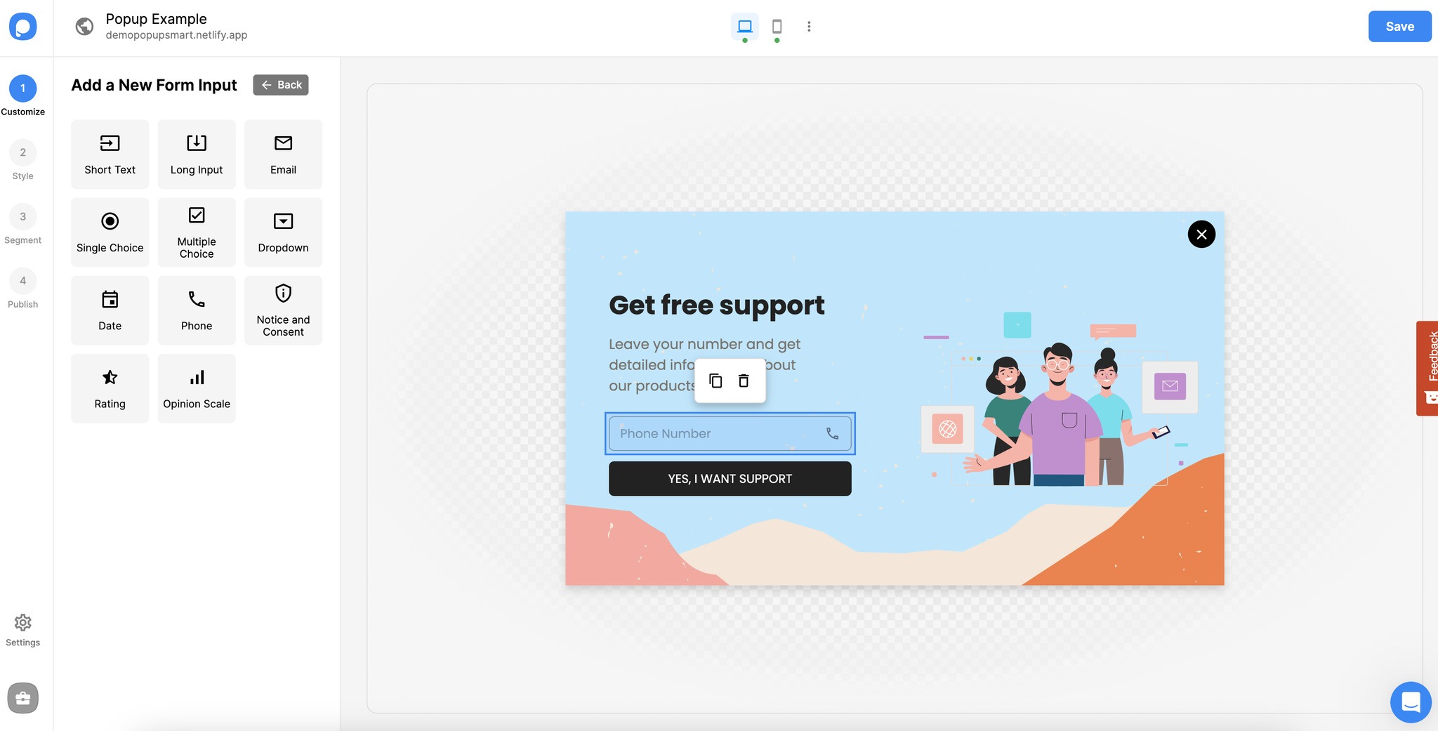
# Form Elements

# Short Text & Long Input
Use the Short Text & Long Input Elements to have an area where visitors can enter text on the popup.
• On the Content part, you can find the Input Name, write the Placeholder -what will be displayed on the text input component, and arrange whether the text is required.
Select the Email Element to have a field in your popup where users can enter their email addresses. This is one of the most needed components of our popups when you create campaigns to get emails from your visitors.
• On the Content part, you can find the Input Name, rename the Placeholder, and decide whether the field is required to fill in.
# Single Choice
If you direct a question to your visitors that need to be picked within two or more choices, a single choice may help you present the options.
• You can determine the options you need and add more options. Also, you may decide if it’s required or not.
• You can decide the single choice style as dot, tick, or A/B.
# Multiple-Choice
Select the Multi-Choice Element to give users the opportunity to choose more than one option.
• You can add a label and edit the options. If the multi-choice component is required to add, you need to toggle it on.
• You can decide whether the type should be checked or A/B.
# Dropdown
Use the Dropdown Element to show options that users can choose in a dropdown area.
• You will view the Input Name, name the Placeholder, and arrange different options for your dropdown. Requisiteness depends on your choice; you can toggle it on or off.
# Date
Add the date element to your popup to allow users to choose a date.
• Knowing that the calendar is displayed when you click the component on your popup design directly is important.
• You can see the input name and edit the Placeholder text on the Content part. Besides, it’s possible to decide whether the date is required.
# Phone
Select the Phone Element to have a field in your popup where users can enter their phone numbers.
• You can name the Placeholder, arrange the showing countries, and determine the requisiteness of the filling-in.
• You can also add a prefilled value to your phone element.
# Notice and Consent
Use the Notice and Consent Element that you can use to get consent from users and/or inform them. You can fully customize the text of the element.
• There are Input Name, Notice& Consent Name, where you can edit the text, and the Required field to determine if the confirmation is needed.
# Rating Element
Select the Rating Element to find out how users evaluate their experience based on heart numbers, star numbers, or emoji types.
• You can set the Rating Names, different Rating Types, Actions based on the rating type you have chosen, and the requisiteness situation.
# Opinion Scale Element
Select the Opinion Scale Element to determine how users evaluate their experience based on numbers.
• You can scale numbers from the dropdown as 1 to 3, 1 to 5, and 1 to 10.
• Since you collect feedback from your visitors or your customers, there are different actions to add the button. Don’t forget to add the URL and page to direct the action.
• You can toggle on Guide Labels.
• Also, the requisiteness of choice depends on you, don’t forget to consider it as well.
# Form Button
Form button is used as submit button, and it comes automatically when you add a form to your popup.
You can also add another form button element from “Add a secondary button.” With this button, you can direct the user to another step of the popup, make the user go to a specific URL, make his/her call a phone number, or only close the popup.
Use the Form Button, which is an interactive element activated by a user after filling out a form.
• You need to keep Count as Interaction toggled on if you want to include your visitors’ interactions with the form button.
If you have any questions related to which elements to add to your popup, feel free to contact us!


